
The Shape of Things to Come

March 20th, 2023
What is a Treasury yield curve and why does it matter?
There’s been a lot of attention from economic pundits and the financial press on the so-called “yield curve inversion” as an indicator of impending recession. Many people don’t know what the yield curve is and why inversion matters. The picture is often made more cloudy because often times the yield curve is referenced as a single data point. For those not enmeshed in financial markets on a daily basis, it can be confusing. So, let’s begin with a yield curve primer.
What Is a U.S. Treasury Yield Curve?
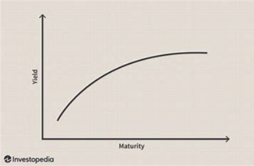
“The U.S. Treasury yield curve refers to a line chart that depicts the yields of short-term Treasury bills compared to the yields of long-term Treasury notes and bonds. The chart shows the relationship between the interest rates and the maturities of U.S. Treasury fixed-income securities. The Treasury yield curve (also referred to as the term structure of interest rates) shows yields at fixed maturities, such as one, two, three, and six months and one, two, three, five, seven, 10, 20, and 30 years. Because Treasury bills and bonds are resold daily on the secondary market, yields on the notes, bills, and bonds fluctuate.” (Source: Investopedia)
Here is a representative picture of “normal” yield curve:
What is an inverted yield curve?
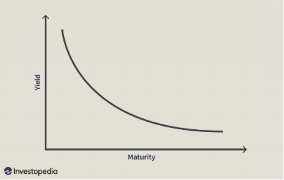
“An inverted yield curve instead slopes downward and means that short-term interest rates exceed long-term rates. Such a yield curve corresponds to periods of economic recession, where investors expect yields on longer-maturity bonds to become even lower in the future. Moreover, in an economic downturn, investors seeking safe investments tend to purchase these longer-dated bonds over short-dated bonds, bidding up the price of longer bonds driving down their yield.” (Source: Investopedia)
Here is a representative picture of an “inverted” yield curve:
The reality is that the messy real world yield curves rarely look like these smooth and tidy representations. It is true that real-world curves sometimes resemble the “normal” curve and sometimes resemble the “inverted” curve. Often, the yield curve inversion is reported as a single number by subtracting the two-year yield from the 10-Year yield (the so-called 10-minus 2 constant maturity yield curve.) When the yield curve is normal that number is positive and when it is inverted, that number is negative. Below is a time series plot of that single number over time through March 17, 2023.
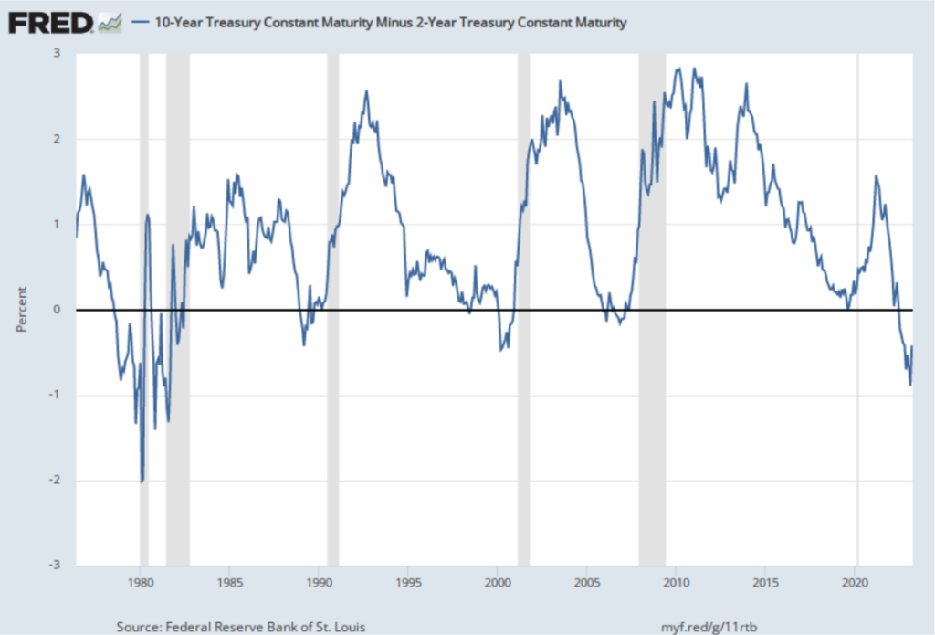
You can see the inversions as measured by the 10-minus-2 are the periods when the blue plotted line is below the horizontal black line. We are the most inverted presently than we have been since the early 1980s. We have a deeper inversion than experienced either in the dot com wreck of 2000-2002 or the 2008-2009 Great Financial Crisis.
What does it mean?
With remarkable predictability, a yield curve inversion ALWAYS precedes a recession. However, there is so much uncertainty beyond this observation that many find yield curve inversions of little help in framing investment decisions. For example, after an inversion, there can be significant economic lags between the inversion and the arrival of recession. Sometimes over 18 months or more. And then, there is the messy relationship between the inversion event and stock market returns. The market tends to lead the recessionary impulse by many months.
Usually, the stock market is ripping higher at about the same time the “powers that be” officially acknowledge the recession. Also, on the official recession proclamation tends to coincide with a return to a “normal” yield curve. So really what becomes important after the yield curve inversion are the elements of the specific recessionary event associated with the inversion. What is the depth, duration, and diffusion of the recession? Is it shallow or deep? Is it short or long? Does it affect only some or all segments of the economy. As of today, ALL of these things are uncertain.
So where does this leave us?
As described above, there is much uncertainty presently. We just experienced the second largest bank failure in US history (Silicon Valley Bank) combined with the bailout of that bank and another (Signature bank). US bank stocks are under pressure given the uncertainty. Moreover, there is presently a bailout of Credit Suisse being orchestrated in Europe. All told, there is dramatic uncertainty. And yet, the stock market has been remarkably resilient; some would say perplexingly so. And the VIX (the so-called “fear index”) has been remarkably tranquil. Frankly, it doesn’t add up.
Our position continues to be to exercise some caution in front of such perplexing and contradictory data. Eventually, we will get some clarity on the shape of the recession and the shape of the yield curve. When the yield curve normalizes we will know more about the recession and have a better idea of where and when to add risk. Until then, focus on the long term and try not to let the headlines scare you or change your long-term investment posture. We are always here to talk, and we thank you for your patronage.
Advisory services offered through WealthPlan Investment Management, LLC.
The opinions voiced in this material are for general information only and are not intended to provide specific advice or recommendations for any individual. To determine which Investment(s) may be appropriate for you, consult your financial advisor prior to investing. Information is based on sources believed to be reliable, however, their accuracy or completeness cannot be guaranteed.
No investment strategy can assure success or completely protect against loss, given the volatility of all securities markets. Statements of forecast and trends are for informational purposes and are not guaranteed to occur in the future. All performance referenced is historical and is no guarantee of future results. Securities investing involves risk, including loss of principal. An investor cannot invest directly in an index.